
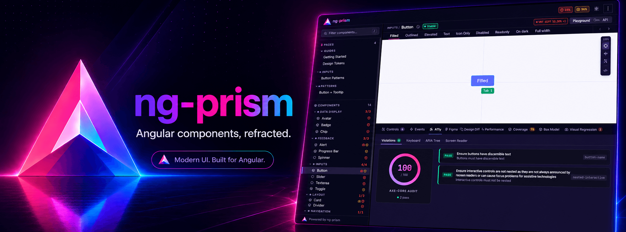
A component showcase tool for modern Angular, without story files.
You add one @Showcase decorator to your component. ng-prism picks it up at build time and generates live controls, code snippets and docs from it.
Live demo · Documentation · npm
| Package | What it does |
|---|---|
@ng-prism/core |
Scanner, builder and the styleguide app |
@ng-prism/plugin-jsdoc |
API docs from your JSDoc comments |
@ng-prism/plugin-box-model |
Margin, padding and border overlay |
@ng-prism/plugin-coverage |
Test coverage per component |
@ng-prism/plugin-figma |
The Figma design next to the component |
@ng-prism/plugin-perf |
Bundle size, render time and memory footprint |
@ng-prism/plugin-visual-regression |
Screenshot diffs per variant, next to the variant |
Contributions are welcome. The contributing guide explains the setup.
